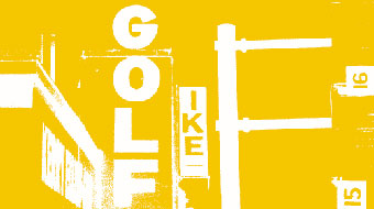

NOISE CHATS TO THE INSITE DESIGN COMPETITION WINNER
An Interview with Timothee Christinat, winner of the Insite Cover Design Competition.
Timothee Christinat is a 23 year old designer based in Adelaide who exercised his creative skills to win the Insite Cover Design Competition as part of noise 2003.
Here�s what Roisin O�Dwyer, Editor of Insite had to say about the entries:
�It has been a pleasurable task choosing a cover for Insite from the entrants to the Noise competition. I was flabbergasted by the response, given that Insite is an industry magazine and not at all sexy. Of the 29 entrants there were at least 13 that addressed most of the criteria and produced invigorated designs. I eliminated some because they did not conform to the 2 colour limitation and others because their interpretation of the Words theme was vague. Timothee's design is well considered with a pleasing layout and an intelligent choice of signs to represent the Words theme. His use of colour is effective because he manages the 2 colour limitation without drawing attention to it and I think that takes a bit of skill. Close contenders were haziman strike aenima, Thomas Armstrong, Liv, Adam Paquette, Stylor and Emma Cordrey. Thankyou to everyone that made an entry, you made my day and I'm sure my Editorial Committee will be relieved to have a stylish cover this time around.�
Here�s what Timothee had to say to noise about his entry:
"One of my greatest resources of design, the beauty of this world, has inspired me to capture these views, images and compositions with a photograph. At 23 years of age, I can see a big design future ahead of me and I have always thought, 'there is nothing wrong with having a big vision, but the hardest part is to pursue it'. As a passionate designer, it makes it easier to see your vision come true.
Freelancing to a design company in Adelaide, working on a major project such as the Adelaide Fringe Festival while running my own design business, keeps me occupied. However spending some time on projects such as the Insite magazine is always a great experience.
Amongst design other interest I have are snowboarding, downhill mountain bike riding, surfing and basketball."
Tell about your idea for the Insite cover.
As a project that is part of noise, I wanted something that was youthful, and also communicating how words are represented and used typographically on the streets. I wanted to put together many words from different places and creating a unified page.
How did you put the whole thing together?
I produced a variety of photographs of signs and words found on the streets that were already visually interesting and placed them together applying the same colour to all the type to make one piece of work, then included the headings and logos to suit the image.
What aspects of making the design were challenging?
Not to include many typographic photos I have taken, which would make the design to busy and lose the effect.
The theme of the cover was Words. What do you love and/or hate about them?
I love that two words can encourage someone, yet I hate that two words can also bring one person down.
TO check out the other Finalists in the competition click here!
|
|
|





